In this tutorial, you’ll learn how to apply cinematic color grading to your photos. We’ll go after the teal & orange cinematic look for this tutorial. Adding teal coloring to shadows and warm colors to skin tones is a go-to cinematic coloring choice for everyone as it is inspired by Hollywood. Achieving cinematic tones requires basic knowledge of Photoshop, and with the help of a bunch of adjustment layers, we can get the job done. Let’s get started!
Step 1 – Basic Adjustments
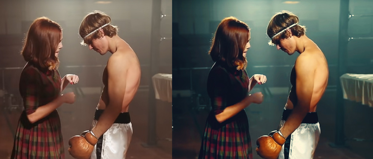
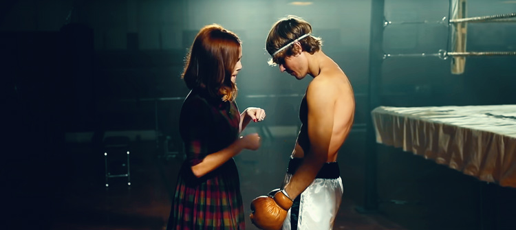
For this tutorial, I’ll color grade the footage of Justin Bieber’s latest Anyone song. The song came out on the New Year Eve of 2021. After that, I saw the making of this video, and I decided to capture some screenshots of it to color grade them. You can see in the below image that I have opened the screenshot. Also, no need to worry if you are working on a different image, the technique that I am going to show will work on any image.
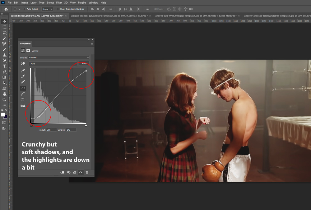
Before you start color grading your images, you should make some basic adjustments to highlights & shadows. Go to Layer > New Adjustment Layer > Curves, and then use the following settings to make the shadows soft and crunchy, and bring the highlights down a bit.
Step 2 – Base Coloring
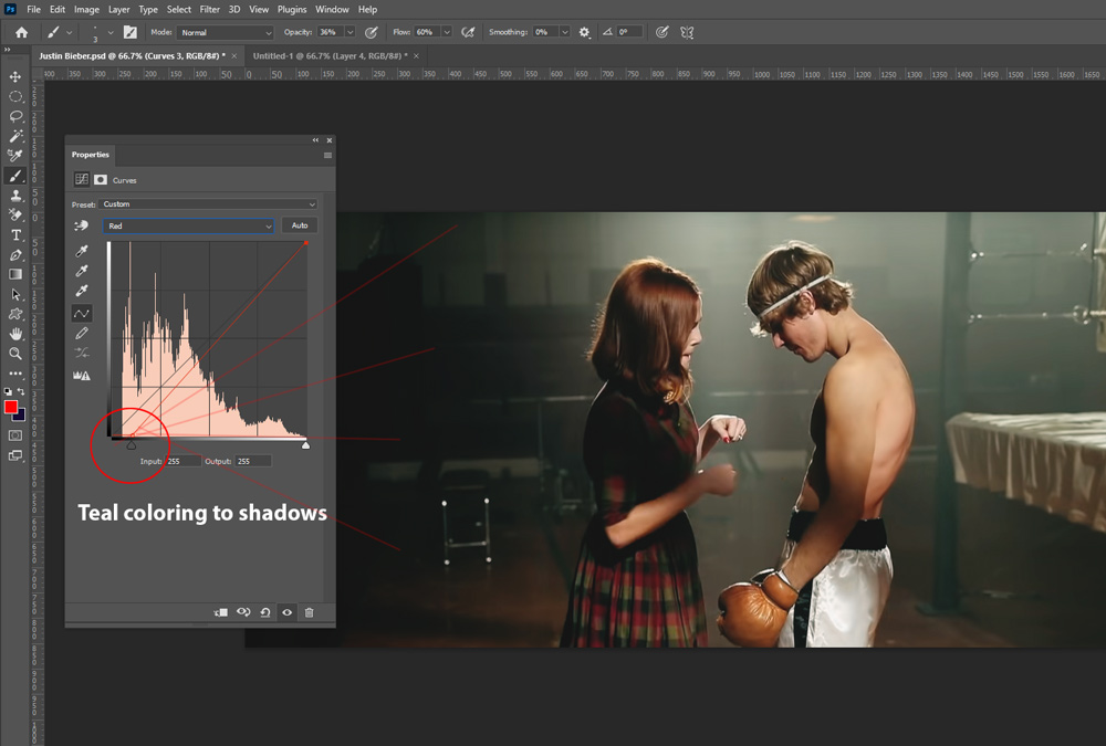
Once you have basic settings applied to the images, we can move forward and start adding a base coloring to the image. I used the same Curves adjustment again but this time I used the Red Channel to add teal coloring to shadows of the image. You can move the shadows slider to right to add teal coloring to shadows.
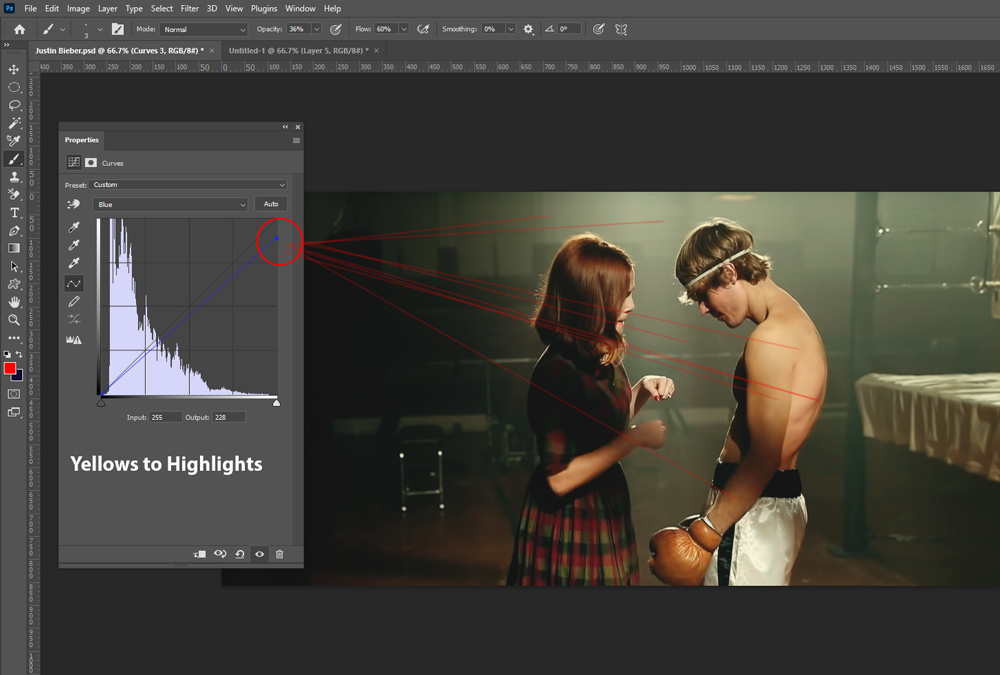
Next, I used the Blue Channel to add yellows to highlights to the image. You can see the settings of the Blue Channel below.
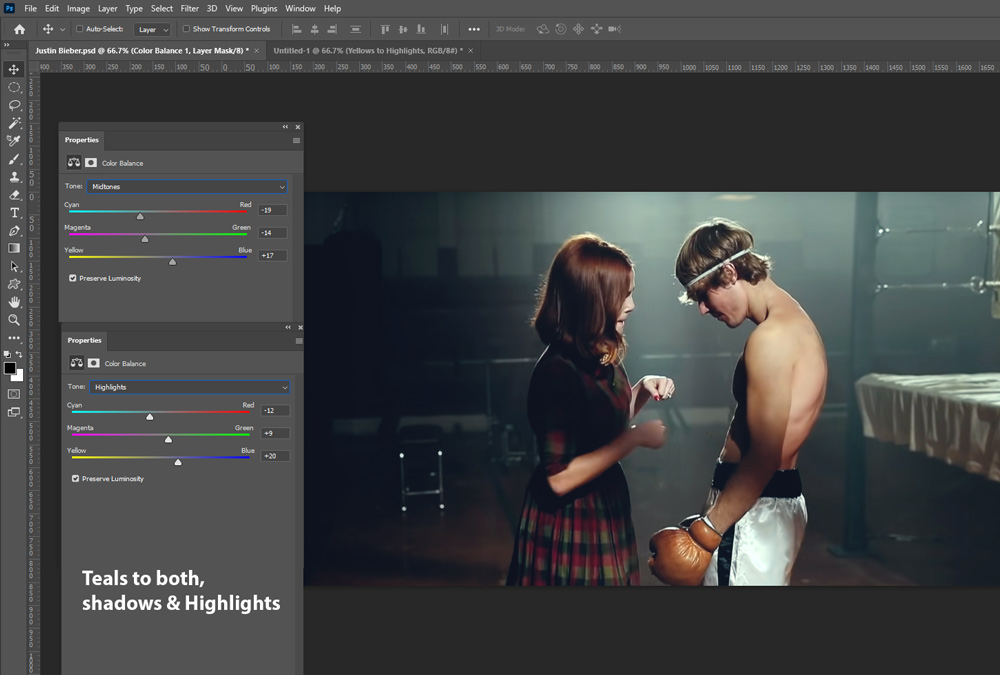
Step 3 – Teal Coloring
The problem with Curves is not only it adds coloring to the image but it also affects shadows and highlights of the image. It also makes them darker or brighter when you color grade images with Curves adjustment layer. To sort this out, I added teal coloring to Midtones and Highlights using the Color Balance adjustment layer. You can go to Layer > New Adjustment Layer > Color Balance, then use the settings below.
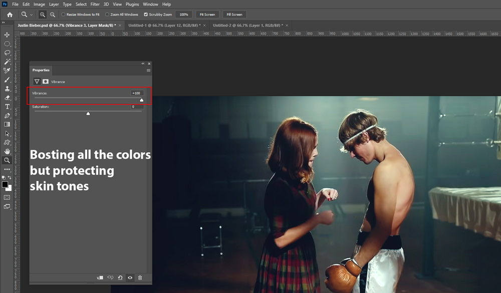
Step 4 – Boosting Colors
This step will boost all the colors of the image but keeping the skin tones intact. To do so, go to Layer > New Adjustment Layer > Vibrance and increase it to the point where you start seeing colors popping. You can also try using the Saturation slider but I won’t do that as it will make the skin tones more saturated and intense, and that I’d like to avoid. Make sure to use Vibrance adjustment layer and also, you can set the values according to your images.
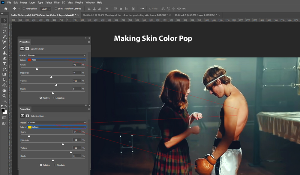
Step 5 – Making Skin Color Pop
In cinematic color grading, you’ll notice that skin tones are always warm because the natural color of the skin is orange. Adding a different color to the skin will make people’s skin look unnatural unless you know what you are doing. To make skin tones pop, I’ll use Selective Color Adjustment layer with the following settings.
If you don’t know how this adjustment layer works, simply keep moving the sliders right or left but always keep an eye on the image to make sure that you are staying in the range of skin tones. Don’t add red hues or any other color to them.
Step 6 – Teal & Orange Look
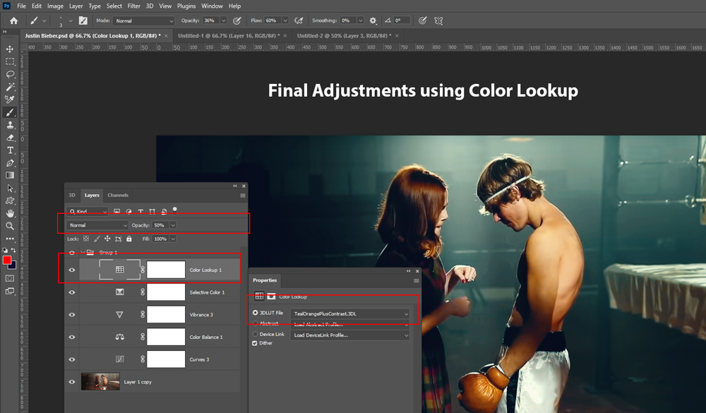
At this moment, we already have the popular cinematic teal & orange look, we just need to finish it off. To do this, go to Layer > New Adjustment Layers > Color Lookup and choose the Tealorangepluscontrast.cube LUT.
The effect of this adjustment layer was too strong for the image so I brought the opacity of this layer down to 50%. You can play with the opacity if your photos need a more intense look.
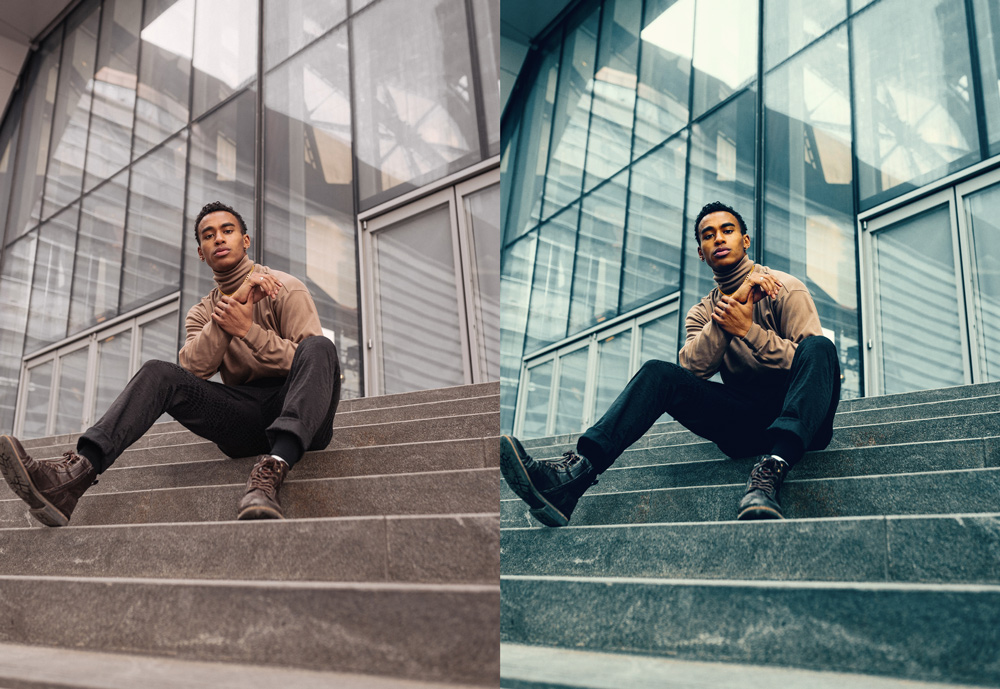
Here are my final results:
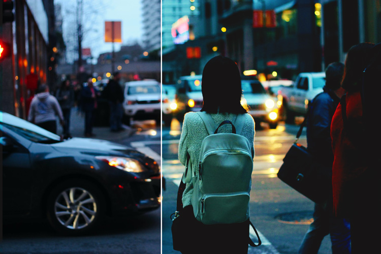
I tested this technique on other images and it is working as expected:
Here is another example with some tweaks:
I hope you enjoyed the tutorial. Give it a go to this technique to add cinematic color grading. If you have questions, please comment down below.
Very helpful. Appreciate your step by step tutorial. Thanks so much
You are welcome!
Awesome